Representational Reflection Drawing
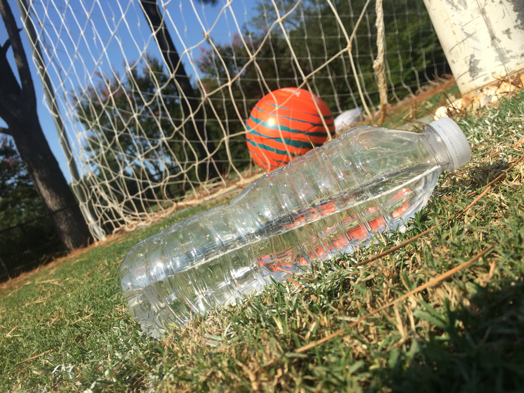
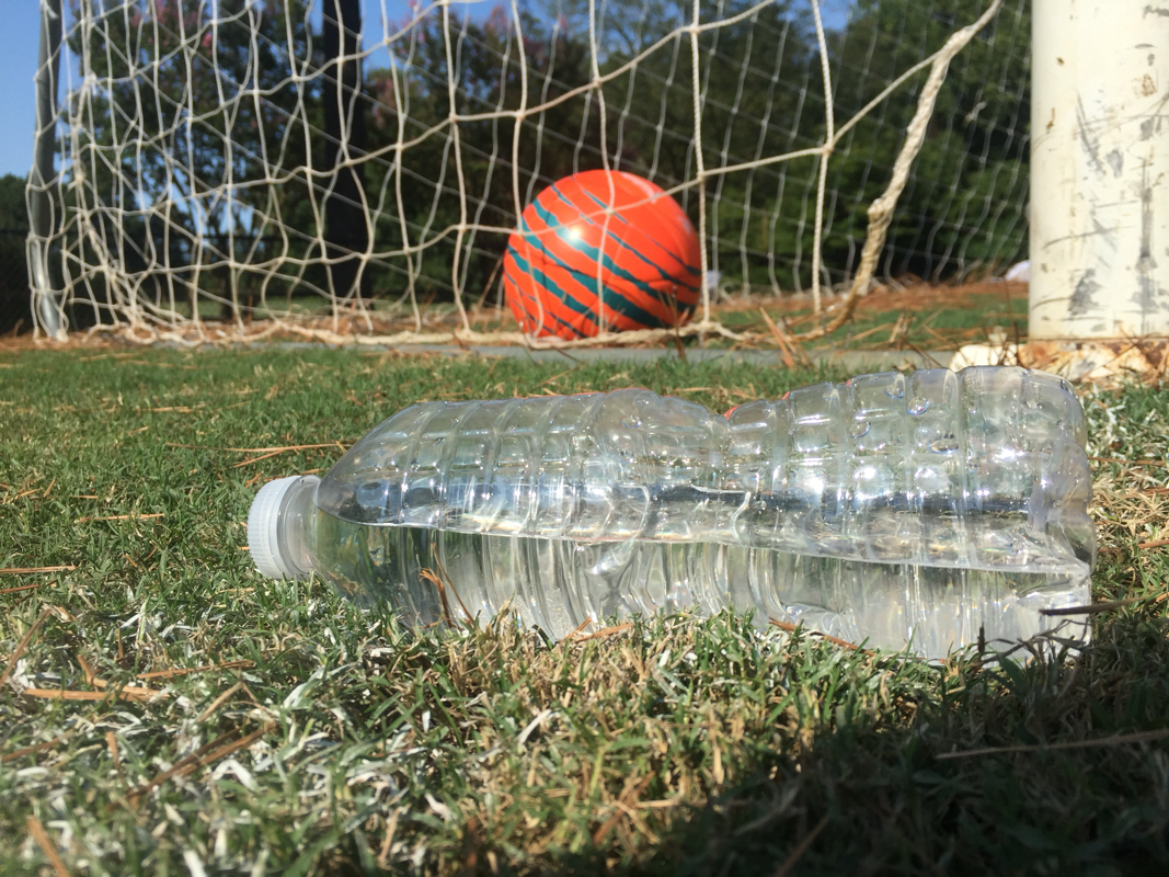
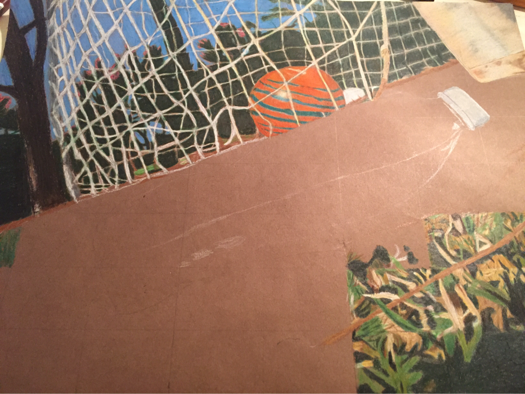
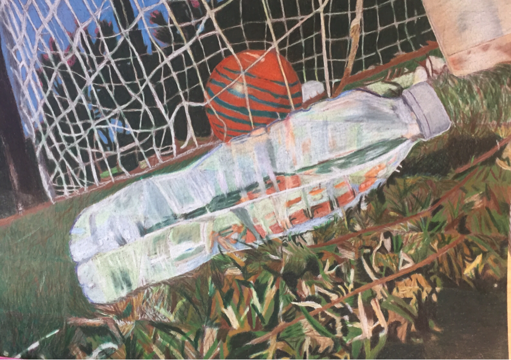
.For my reflection drawing I brainstormed many ideas but the one that really interested me and would be the most challenging for me was the soccer field idea. This idea consisted of a soccer ball in a net and then a water bottle laying sideways on the grass showing the reflection of the soccer ball. When I chose this idea it not only showed a reflection of the soccer ball but also a reflection of myself. Ever since I was little I played soccer and it has been a major part of my life, playing soccer taught me patience, skill and most of all taught me to just be myself.
The Process:
-The first thing I did once I got my idea was I got reference pictures and drew my composition sketches.
The Process:
-The first thing I did once I got my idea was I got reference pictures and drew my composition sketches.
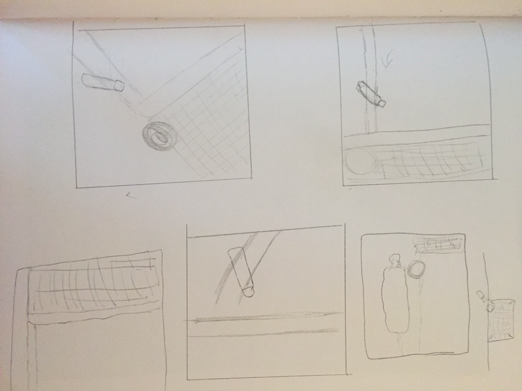
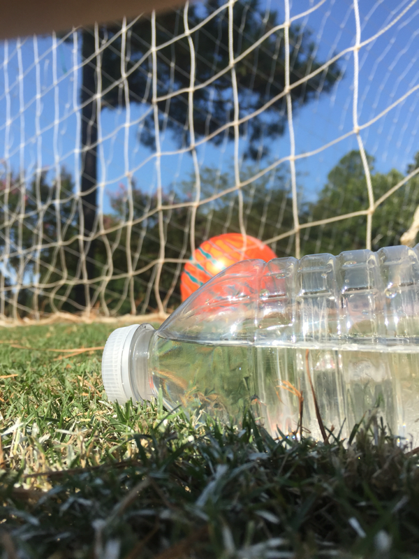
-The next thing I did was take my own picture to make sure I had the right composition I had envisioned in my mind and to guide me through this drawing process. I tried positioning the objects in different ways and see which one worked the best. The composition of a piece is very important so that it will properly show a piece in its best way possible. The one I ended up choosing was the first photo on the left.

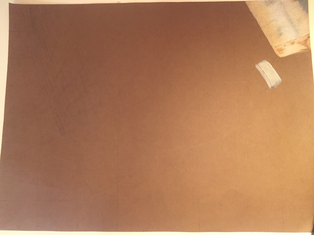
- After I got the final picture I started working on my color sketch to figure out what colors worked best and what paper worked best. I chose to work on brown paper because it compliments the outside color scheme more than the black could. The grass and background consisted on a lot of browns so it was important that the paper be brown to accent those colors and also to make the colors pop.
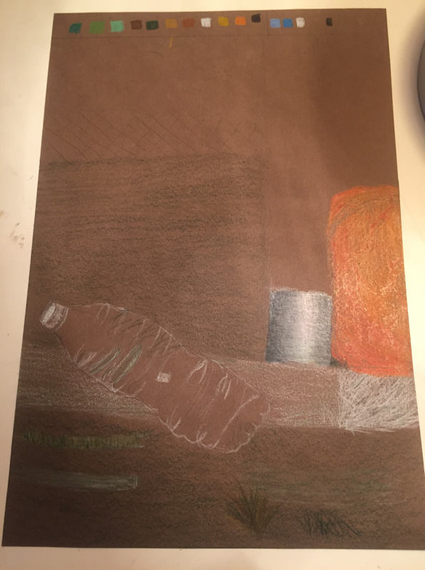
I finally started to work on my final piece, I got all my details sketched out and started to add prisma colors to the piece.
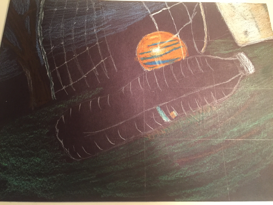
The process of this project took a lot of time and patience, there were so many details to add into it. I have only worked with prisma colors once before so I wanted to make sure I used the right techniques this time. The most important technique for me was doing light layers and slowly building up the colors. After many layers and many hours my art work was coming together. The part I was the most worried about was the reflection. I have not worked a lot with reflections before especially with color but I was interested in exploring with colors that represented a reflection. There were many parts of the water bottle that had reflections including the water inside so I had to get a lot of colors that looked like the actual water bottle itself. Some parts I could improve on is the shape of the water bottle because it does not look the same on both sides. Some other things I would need to work on next time I do prisma colors is to layer a lot more colors and add more contrasts to the sky. Once I completed my art piece the outcome turned out pretty well compared to my first prisma color drawing. Other than a few changes I think I learned a lot about prisma colors and the right techniques to use in order to make a successful piece.
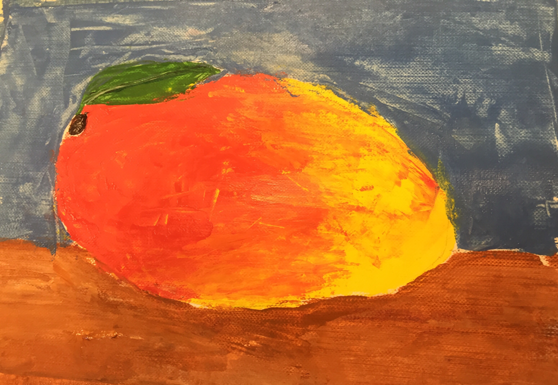
Oil Painting Project
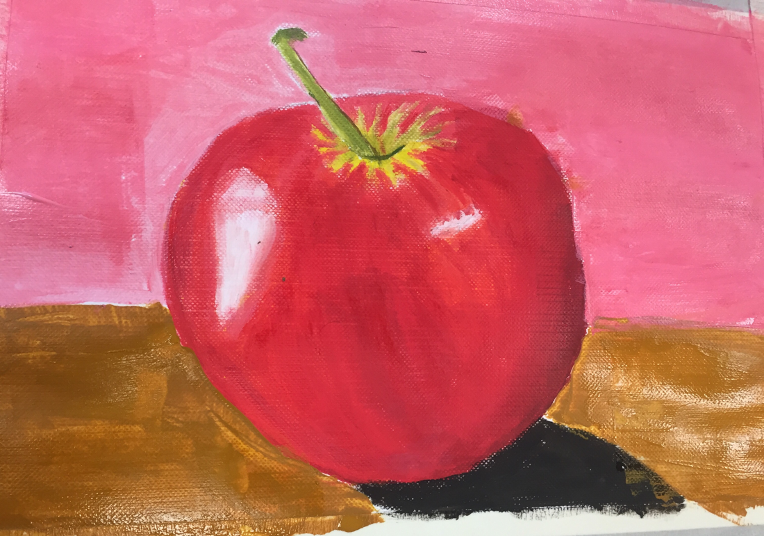
Oil painting is very different from painting with acrylic and water colors. It has a different texture and it has different consistencies as well. There are certain colors that are transparent and some that are opaque. The first time ever working with oils was the practice paintings of fruit. The first fruit I did was an apple and I used paint brushes for this one. The second one I did was a mango with a palette knife, making texture with the actual palette knife itself. I liked using the palette knife because it gave the painting a different, rough around the edges look.
Working with oil paints using the paint brush gave the painting a very smooth look and made it look more realistic. The painting using the palette knife had a more rough look to it and used a lot more paint compared to the paintbrush painting. With the paintbrush painting I was able to get all the small details but with the palette knife it was a lot more difficult. When choosing the backgrounds for each painting I tried to go with more pastel colors because I wanted to make the fruits pop more. Doing these fruits was very helpful in preparing for the main project and helped me decide on what techniques to use.
Working with oil paints using the paint brush gave the painting a very smooth look and made it look more realistic. The painting using the palette knife had a more rough look to it and used a lot more paint compared to the paintbrush painting. With the paintbrush painting I was able to get all the small details but with the palette knife it was a lot more difficult. When choosing the backgrounds for each painting I tried to go with more pastel colors because I wanted to make the fruits pop more. Doing these fruits was very helpful in preparing for the main project and helped me decide on what techniques to use.
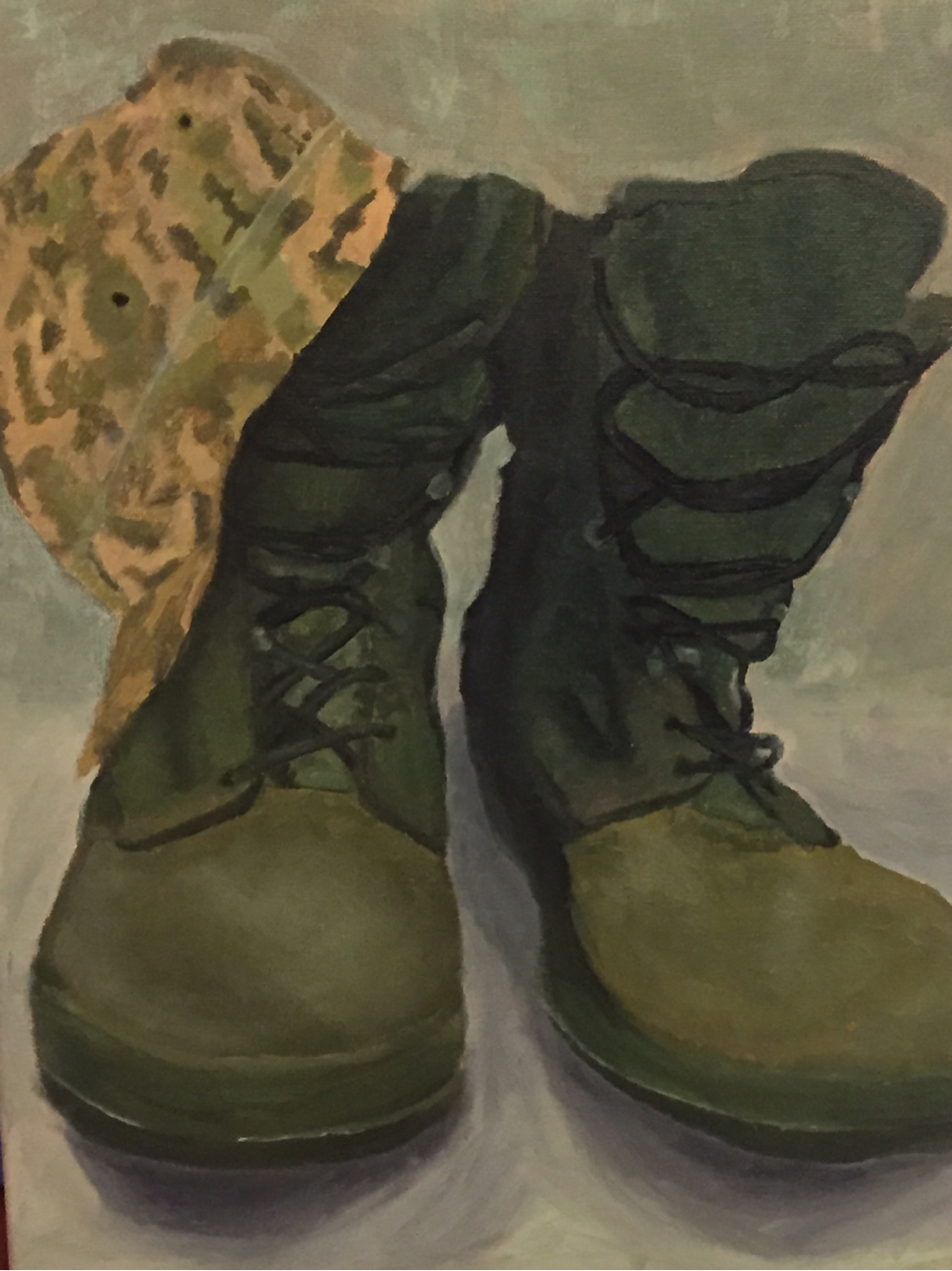
The Final Oil Painting Project!
After testing out oil paints with the fruit, it was time to plan ideas for the main project which was a painting of an object. At first when I was brainstorming I was stuck on the idea of painting my dogs toys and I started to sketch it out but I was not liking it as I sketched it through and got reference pictures. So I ended up scratching that idea and going back to the drawing board. One afternoon I walked around my house to try and come up with an idea, that is when I found my dads military shoes and hat. I loved the monochromatic colors in both the shoes and the hat and I loved how they looked together. I started to take pictures of different compositions and using the one I liked the most. I then started to sketch out the shoes and hat to see exactly how I wanted it. I used my reference picture to sketch my shoes and hat onto the canvas. I had to mix colors in order to get the right shade of green for the shoes, so I could give the painting a more realistic look to it. I originally used the palette knife to paint the shoes and it was very challenging to get around the edges. After my realization that there was no way for me to use the palette knife with such a detailed picture I decided to use paintbrushes instead. I took a break from the shoes and started to work on the hat. As I was adding in colors going off of the actual picture I realized that it was very difficult to get the camo to look exactly alike, so I then decided to experiment with colors and see which ones work best in different places and making sure those colors looked like the military camo. After finishing the hat I came back to the shoes and worked on the laces and the surrounding areas. Once I finished both shoes I looked at them and realized that there was not as many highlights and shadows as I wanted. I ended up changing the colors of the shoe laces to a darker green so that they would pop out more. I think that once I got the hang of using the oil paints my piece got better and more uniformed. After finishing all the objects I started to work on the background and this was the part I got stumped on until I asked Mrs.Rossi what to do and she said it would be cool to keep the monochromatic theme I had going on. So I did some lighter greens for the background and adding in the shadows around the shoes as well. I think I needed to add more shadows around the hat to make it look three dimensional and add more highlights to the tops of the shoes. Since this was my first oil painting piece it was definitely challenging but a great learning experience if I were to do another oil painting in the future.
I went back and revised my object painting, adding a lot more shadows and highlights underneath the hat and on the top parts of the shoes. I also added more details to the hat to make it look more realistic. After adding these details the painting definitely looks more complete and more realistic.
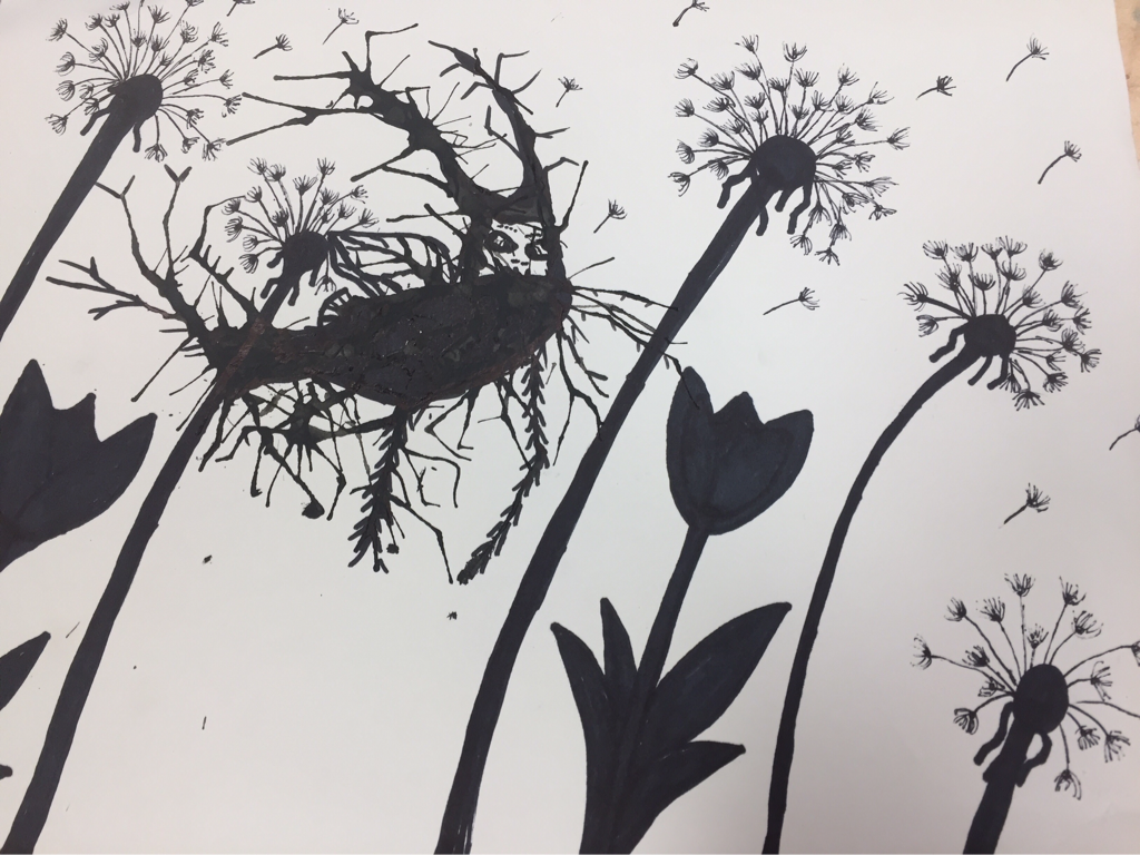
Inktober
For the inktober project we worked with our mentees and splattered ink with a straw. We blew the ink around the paper and the ink went it different directions. After we got the ink where we wanted it, it was time to create something. Looking at my splattered ink, it kind of looked like some kind of bug just without any features. With a sharpie and pen I started to add in some details like wings, antennas and legs. The bug I made is pretty much a mixture of a mythical monster and a bug because of its unique features. Once I got the bug how I wanted it, I started to work on the background. My first thought was to do a nature scene because it was a bug and they are usually found in nature. I added in dandelions and tulips and made them close up because the bug was a small size compared to the paper. I made it so that it looked like the bug was flying at the same height as the top of the dandelions which means there was no close up grass seen. My mentee was not there that day so I sat next to one of the art 1 students and he was doing a great job, he was really focused on blowing the ink in a specific way so that he could get it exactly how he wanted it. I also walked around the class to see what the other students had done, and the did an excellent job and they were very creative.
Interior Spaces
When I heard that we were doing the interior spaces project I was surprised because I had already done one over the summer but I was super excited because I got to create a whole new idea and challenge myself even more. I brainstorming ideas and out of no where a completely random idea came to mind. I thought it would be so cool to do inside an old View-Master toy where kids could watch clips of movies, shows or cartoons. I was worried that I would be unable to capture the inside of the View-Master clearly, so that day I went home and took pictures. I was able to take my own pictures because I own two View-Masters with a lot of the slides that go with it. I was surprisingly able to get great pictures that showed the inside of the toy but also showed the toy itself. Once I got the reference picture I liked the best I started to sketch it out on a canvas. The media I wanted to use was acrylic because I felt like the bright, strong color that acrylics give would make this piece stand out and would be represented well. After getting it all sketched out I started to paint it the base color of the View-Master, while that was drying I worked on the bottom part of the toy which was a darker red. I had to add shadows and highlights to both parts so that it would look three dimensional. This was a very challenging part of the whole piece because the reds blended together so it did not look at 3D as I wanted it to. I added a lot more dark's and some oranges to the top and that helped some but it still looks a little flat to me. Once I got all the details done on the View-Master except for the interior part, I started to work on the stack of the slides. I was very nervous to do this part because there were so many small lines that were included in the stack but when I painted it I just started to add random lines and to my surprise it actually looked like it was a stack of slides. Doing the brown table was fun because I added so many colors into it and added some texture into it as well. There was a giant highlight on the table and in the picture it was really bright but in my painting I toned it down a bit because the rest of my colors in my painting were not as bright as the picture. I thought that it would make the piece connect more if I toned it down just a little bit. Overall I think this piece turned out well and it was definitely a challenging piece to do. The inside of the View-Master took a couple of tries but I think that I captured the inside of the toy well, I made the slide inside look blurry because that is how the toy kind of worked from that angle. There were a lot of details in this project and some were definitely challenging but it was a fun project to do.
Self-Portrait
For the self portrait project I wanted to do something different from my previous portrait I did over the summer. Over the summer I did a self portrait in acrylic paint and did color blocking. The first thing I did for this project was I started to brain storm ideas. At first I wanted to do an illusion where it looked like my hands were off the self portrait but then as I continued to think of ideas I came up with the idea of myself hanging upside down. When I was little every time I would go to the playground I would go on the trapeze bars and hang upside down. So once I had my idea all figured out I had to get my reference pictures. I went to the Kelly Road playground and took pictures there while little kids stared at me thinking I was crazy. After getting the pictures I started to sketch out my portrait. The medium that I decided to use was just pencil, focusing on the different values of the piece. I did not realize how long it would take to do pencil especially doing a 16 by 21 inch piece. I began to work on my arms and legs, oh yeah did I mention that I was also doing most of my body as well in this portrait... Anyway, I started with that because I thought it would be an easy part to begin with and then slowly get to the more difficult parts as I went on through this project. I then worked on the shorts and shirt and that went pretty well, I was not sure how to get the creases in the shirt but then I asked a fellow classmate and they helped me out and gave me some pointers. I finally finished all of the body except for the head. I was so hesitant when doing the head because I have never really done a head portrait in pencil let alone upside down. It took a while to sketch it out right and Mrs. Rossi helped me with getting the measurements right but I kept changing parts of it because I didn't like how it looked. Once I added in the values it looked a lot better. After I finished working on my body I started to work on the background. The background was just straight pieces of wood from the playground. This was surprisingly very challenging because getting those lines exact was difficult and making it look realistic was difficult as well. The last part I had to do was the ground which was this mulch like texture. I had no clue how to do this so I tried my best to make it look right but it still doesn't look how I want it to. I really liked how my body turned out and the clothes turned out well too. Some things I might need to change and fix would be the look of my hair and the background. Next time I would like to add a little pop of color just make the piece stand out more because all the grays sort of blend together. Overall this is a fun project and I learned a lot about drawing with values.
Pet Portrait
This was the project I was looking forward to all semester because I love my puppy and I couldn't wait to paint her. I knew I wanted to paint her on a canvas because I thought that I could best represent her and get the texture of her fur by painting. It was difficult to decided which picture to do but I finally went with the one that showed off her personality. At first I was going to do an acrylic was painting but then I decided to just do an acrylic painting. I first sketched out the general idea of what Tootsie (my puppy) would look like and then lied down my brown sienna base color. I then started to paint the ear because I thought that would be the best place to ease into the project. Once I started to get the general idea of how to paint her fur I added in the appropriate highlights and shadows. It was hard to get her color exactly because she is mostly black but luckily there were a lot of highlights in the picture. For most of the painting I put down a dark gray color to give my dog some depth in her fur. The nose was probably the hardest part of the painting because it was shaped odd in the picture but once I focused on the shapes it looked a lot better. My favorite part to do was the eyes because it really gave her that puppy look, it was a little tricky getting the highlights in the eyes but I think it turned out well. After I finished painting Tootsie I started on the background. I did not want to do the original background because it was plane white. The picture was actually taken at her first visit to the vet and she was just laying down on the table looking cute. I then decided to change it up and do fabric, I looked up reference picture of crumbled fabric but it was hard to know exactly what it would look like if she was laying on it. I ended up doing a sort of ombre blue background. I tried making the shadows underneath Tootsie but I still think that the blues need to blend together more. If I would change anything on my painting it would be the background, I would either try and do the fabric again or make the blues blend better and transition better. I think that this project was really fun and I enjoyed painting my puppy!
Landscape
This project had a lot of ups and downs during the process. I decided to do a photo I took at Busch Gardens of a pond, river type water structure with a fountain. I first started sketching the outlines of each part of the piece and then I started adding the base colors. I took my piece home one day to work on it and with my luck my dog stepped on it and punched a hole through it. There was no way of fixing this so I had to start over. It was a good thing that I was not extremely far into the project or I would be devistated. Starting from square one I got the base colors back on the canvas and the colors were a lot better than the first painting. I then added in the foilage and the shadows which was really fun to do because I used a more abstract technique for it focusing more on the lights and darks. The next thing I added was the fountain which turned out well. I then started on the waterfall which was so difficult because it had a lot of textures involved in it. I focused more on the colors of each part which helped until I got to the shadow hovering over the waterfall which was very difficult because the shadow just did not look right no matter how many times I tried to fix it. I finally got a decent shadow color that worked for the painting. I also added in the water going down the wall and at first I had it going straight down but then I changed it to a curve because it worked better with the angle of the painting. I think that if I blended some of the edges more where the water fall began and ended it would bring the piece more together. For the most part I think this project turned out well and if I changed just those couple of things I think this piece would be better.
Map Project
I was really excited for this project because I knew exactly what I wanted to do. I love modge podging related newspaper onto a canvas and then painting over top of it to kind of tell a story. When I heard about this project I thought that using a map as the background instead of newspaper was the right path to take. The next part I had to come up with was what region I was going to do. I started going through my pictures and I found some that I took of the Cape Hatteras Lighthouse in the Outerbanks and thought that it would work perfect. I started modge podging the maps of the Outerbanks as the background and once that dried I started painting the art piece based off the picture I took. I added in some green grass and painted the sky and sand with watercolor. I took this to school and Mrs.Rossi pointed out that it was too in the middle of the canvas and that there needed to be detail in the painting. I ended up changing most of my painting... Instead of continuing with the brown houses and the grass I decided to change it to sandhills, finishing the bottom of the lighthouse and adding in a wood walkway. I struggled a lot with getting the sandhills exacty and the walkway in the right place. After a lot of painting over and a lot of readjusting I finally got it to look some what decent. Orginally with the walkway I was going to add a fence along side of it but then I realized most walkways at the beach are just wood pieces on the ground. I think that all I need to add is more shadows to the wood to make it look more realistic. I added in the ocean which turned out really well and I liked the color of the water and I also fixed the sky making it more bright and noticable but still showing the map through it. I think that this was a challenging project but I think I learned a lot about how my process of thinking works and what I can do for future projects.
